

Your product has changed three times since the website copy was written. Sales is using a deck from two quarters ago. The feature launch page still says "coming soon." And your CEO just asked why the product story "doesn't feel tight."
You know the problem. The positioning doc you crafted is solid. But by the time it reaches a prospect through a landing page, a sales call, a follow-up email, and an onboarding sequence, the story has drifted. Every touchpoint adds a new interpretation. Every team member paraphrases differently. The narrative you built gets diluted before it reaches the people who need to hear it.
According to Gartner's research on B2B buyer journey, the majority of the B2B buyer journey now happens before a prospect ever talks to a sales rep. That means your product story has to land without you in the room to explain it. Static decks and text-heavy docs can't carry that weight alone.
Product storytelling software exists to close this gap. But the category is broad, and the right tool depends on which part of the story you need to tell, and how. This guide evaluates 12 tools across interactive product experiences, visual narratives, data storytelling, and content design, all through the lens of what matters to SaaS product marketing teams in 2026.
What's inside
This guide covers 12 product storytelling tools organized by the type of storytelling they enable: interactive product experiences, visual and web storytelling, data storytelling, and content design. Tools were chosen based on relevance to SaaS product marketing, ability to support multiple GTM touchpoints, real user ratings (G2), and pricing transparency. The list spans multiple categories because product storytelling is not one tool. It's a stack.
TL;DR
- Product storytelling software spans interactive demos, visual web content, data visualization, and content design. The right tool depends on which part of the story you need to tell.
- Guideflow is the strongest option for PMMs who need prospects and stakeholders to experience the product firsthand through interactive, self-serve demos.
- For data-driven narratives, Tableau and Power BI remain the standards, but they typically require analyst support to build views.
- Visual storytelling tools like Shorthand and Ceros work well for long-form product narratives and launch content.
- The biggest gap in most PMM storytelling stacks is the "show" layer: letting buyers click through the product instead of reading about it.
- Most tools on this list offer free tiers or trials, so testing before committing is straightforward.
What is product storytelling software
Product storytelling software is any tool that helps teams create, distribute, and measure narratives about a product's value, capabilities, and differentiation. The category is broad by design. It includes tools for interactive product experiences, visual web content, data-driven narratives, and designed assets.
This is different from generic content creation or data visualization. Product storytelling is specifically about communicating what a product does, why it matters, and how it works, across the buyer and user journey. A Canva template for a social post is content creation. A personalized interactive demo that walks a prospect through your core workflow is product storytelling.
Core components of product storytelling software typically include:
- Narrative creation: positioning docs, web stories, interactive experiences, data presentations
- Distribution: embeds, links, sales enablement portals, landing pages, email, social
- Measurement: engagement rates, completion rates, conversion tracking, adoption metrics
- Collaboration: versioning, approvals, cross-team editing, brand controls
For SaaS PMMs, the most effective product stories are increasingly interactive, not static. Buyers want to experience the product before committing to a call.

According to recent buyer enablement research, self-serve evaluation is now the default expectation, not the exception. Interactive storytelling tools, digital storytelling platforms, and data storytelling tools each address different moments in this journey, and the strongest storytelling stacks combine several of them.
When to use product storytelling software
Product launches: When you need a consistent narrative across landing pages, sales decks, email campaigns, and in-app messaging. A single positioning doc can't survive translation across five channels without dedicated product launch software to maintain the story.
Sales enablement: When Sales needs to show the product's value, not just describe it. Interactive demos and demo centers perform best here because they let prospects experience the product on their own terms, without scheduling a live call for every stakeholder.
Competitive differentiation: When features converge and the story becomes the differentiator. Visual and interactive formats make the narrative tangible in ways that bullet-point feature lists cannot.
Customer onboarding and education: When new users need to understand core workflows fast. Interactive guides and product tours reduce time-to-value by letting users learn by doing, not by reading.
Investor and analyst communications: When you need a polished, data-backed product narrative for board decks, analyst briefings, or fundraising materials. Data storytelling tools turn raw metrics into compelling visual narratives.
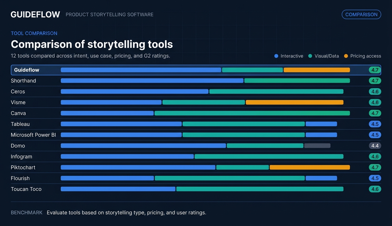
Comparison table
Here's how the 12 product storytelling tools compare across intent, key use case, pricing, and user ratings.
| # | Product | Intent | Key use case | Pricing | G2 rating |
|---|---|---|---|---|---|
| 1 | Guideflow | Interactive product storytelling | Self-serve demos, product tours, demo centers | From $35/mo | 4.7/5 |
| 2 | Shorthand | Visual web storytelling | Long-form product narratives and launch pages | Custom pricing | 4.6/5 |
| 3 | Ceros | Interactive content design | Immersive landing pages and microsites | Custom pricing | 4.5/5 |
| 4 | Visme | Visual content creation | Presentations, infographics, and product one-pagers | Free tier; from $12.25/mo | 4.5/5 |
| 5 | Canva | Accessible design | Quick-turn product assets and social content | Free tier; from $12/mo | 4.7/5 |
| 6 | Tableau | Data storytelling | Data-driven product narratives and dashboards | From $75/user/mo | 4.4/5 |
| 7 | Microsoft Power BI | Enterprise data storytelling | Cross-functional reporting and product analytics | Free tier; from $10/user/mo | 4.4/5 |
| 8 | Domo | Business intelligence storytelling | Executive dashboards and real-time product metrics | Custom pricing | 4.4/5 |
| 9 | Infogram | Data visualization design | Charts, maps, and embeddable data visuals | Free tier; from $19/mo | 4.7/5 |
| 10 | Piktochart | Visual reports and infographics | Product reports, process docs, and internal comms | Free tier; from $14/mo | 4.5/5 |
| 11 | Flourish | Animated data storytelling | Interactive charts and scrollytelling for product data | Free tier; custom for teams | 4.6/5 |
| 12 | Toucan Toco | Embedded analytics storytelling | Customer-facing product analytics and dashboards | Custom pricing | 4.4/5 |
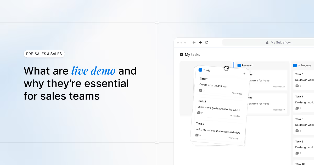
1. Guideflow

Guideflow is a demo automation platform that turns your product into interactive, self-serve experiences prospects and customers can click through on their own. For PMMs, this solves the "show, don't tell" problem at scale. Instead of describing what the product does in a deck or landing page, you let buyers experience it directly.
The workflow is built for speed. Capture a product flow in a few clicks directly from your browser, customize it per persona or segment, embed it on a landing page or share via link, and track who engaged with what. This is product storytelling that works across the full GTM motion: website, email outreach, sales follow-ups, onboarding, partner enablement, and launch campaigns.
Where Guideflow fits the PMM storytelling stack is in the "show" layer. Visual storytelling tools describe the product. Data storytelling tools quantify the product. Guideflow lets people experience the product. That's a fundamentally different engagement model, and it's the layer most storytelling stacks are missing.
Best for: SaaS PMMs who need prospects and internal stakeholders to experience the product's value firsthand, without scheduling a live demo.
Key strengths
- No-code capture and editing: build interactive demos in minutes from your actual product
- Personalization at scale: customize text, images, graphs, and flows per persona, account, or segment using CRM variables
- Multi-format storytelling: interactive demos, sandboxes, demo centers, mobile demos, and live demos cover every moment in the buyer and user journey
- Advanced analytics: track impressions, completion rates, drop-offs, and conversion at the session level
- AI-powered refinement: auto-generated steps, translations, voiceovers, and avatars to polish demos fast
- Distribution everywhere: embed on websites, share via link, add to emails, Notion, social, and ads
Pricing: Free tier available. Paid plans from $35/month.
Start your journey with Guideflow today!
2. Shorthand
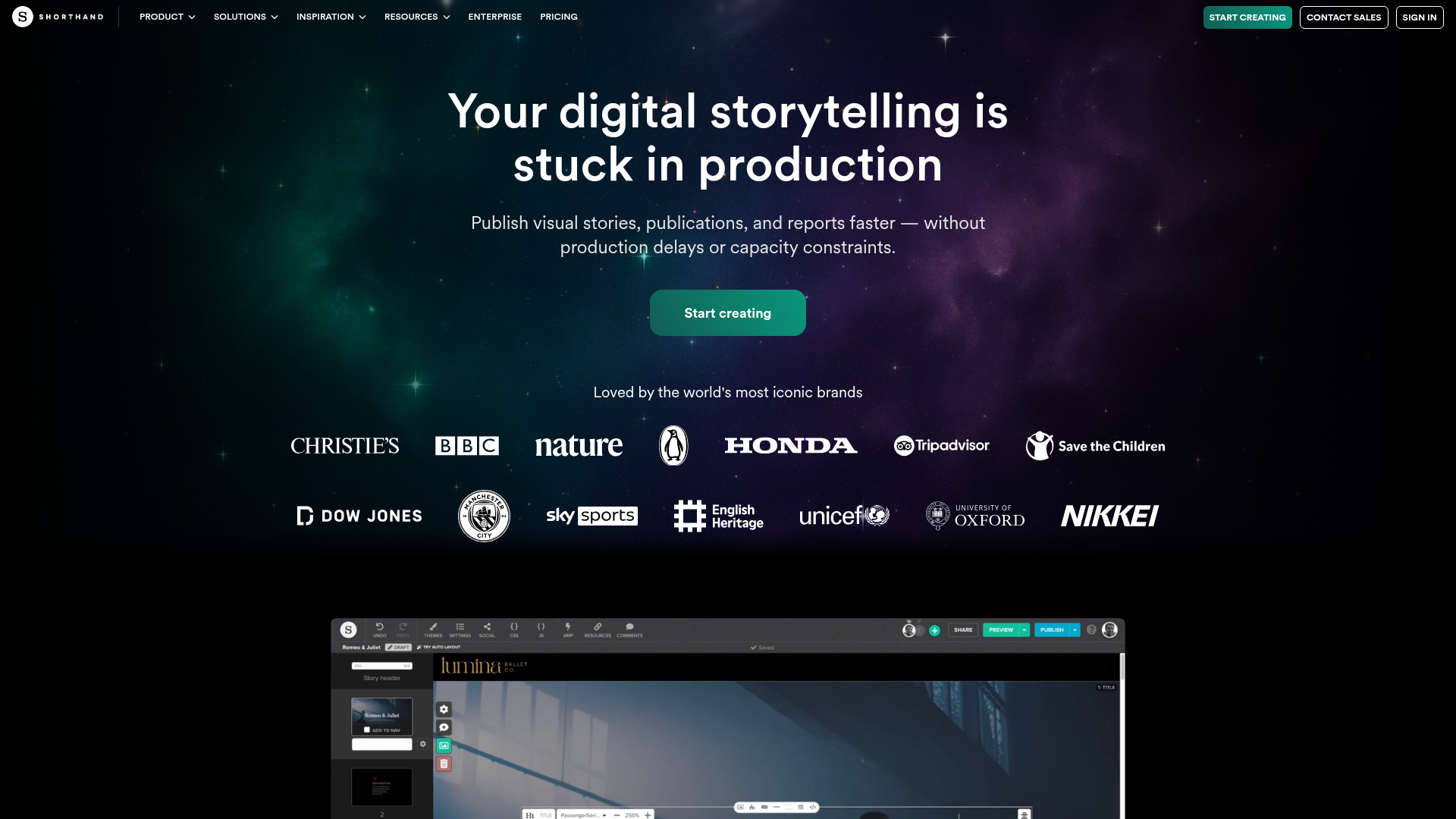
Shorthand is a visual storytelling platform built for creating immersive, long-form web content without code. For PMMs, it's useful when you need a polished product narrative that goes beyond a standard landing page: think launch stories, annual product reports, or deep-dive feature narratives that scroll like a magazine editorial.
The platform excels at scroll-based storytelling effects, parallax transitions, and rich media embedding that make product narratives feel premium. Collaborative editing and brand controls help keep the story consistent across contributors, which matters when your launch narrative involves input from Product, Marketing, and Design.
Where Shorthand fits the PMM workflow is in the "explain" layer. When you need to tell a richer product story than a landing page allows, especially for launches, analyst briefings, or internal stakeholder alignment, Shorthand gives you the format to do it well.
Best for: PMMs who need to publish visually rich, branded product narratives for launches, campaigns, or stakeholder communications.
Key strengths
- No-code visual editor with scroll-based storytelling effects
- Enterprise-grade branding controls and custom domain publishing
- Collaboration workflows with approvals and version history
- Cookieless analytics for engagement tracking
- ISO 27001 and SOC 2 compliance for enterprise teams
- Embeddable content that works across CMS platforms
Pricing: Custom pricing. Contact Shorthand for details.
3. Ceros
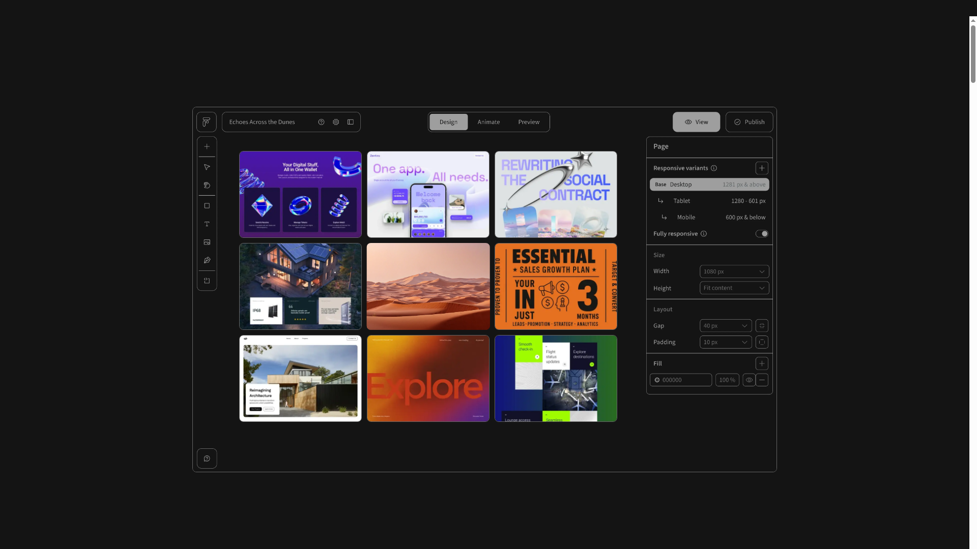
Ceros is an interactive content creation platform that lets teams build immersive, animated web experiences without developers. For PMMs, it's a strong option when you need interactive landing pages, microsites, or campaign content that goes beyond static layouts.
The design studio approach gives you high-fidelity output with animation layers, hover effects, and clickable elements that make product narratives more engaging than standard web pages. The trade-off: Ceros requires more design investment than template-based tools. If you have access to a designer (or a PMM who's comfortable with design tools), the output quality is noticeably higher than what you'd get from a template library.
Where Ceros fits the PMM workflow is in feature launches, event microsites, or competitive comparison pages where visual interactivity helps the narrative stand out. It's one of the best tools for interactive design storytelling when the content needs to feel custom-built, not templated.
Best for: PMMs with access to design resources who need highly interactive, branded campaign content.
Key strengths
- Drag-and-drop design studio for interactive web content
- Animation and interaction layers without code
- Integrations with marketing automation and analytics platforms
- Template library for faster production
- Collaboration and approval workflows
- Engagement analytics for interactive content performance
Pricing: Custom pricing. Contact Ceros for a quote.
4. Visme
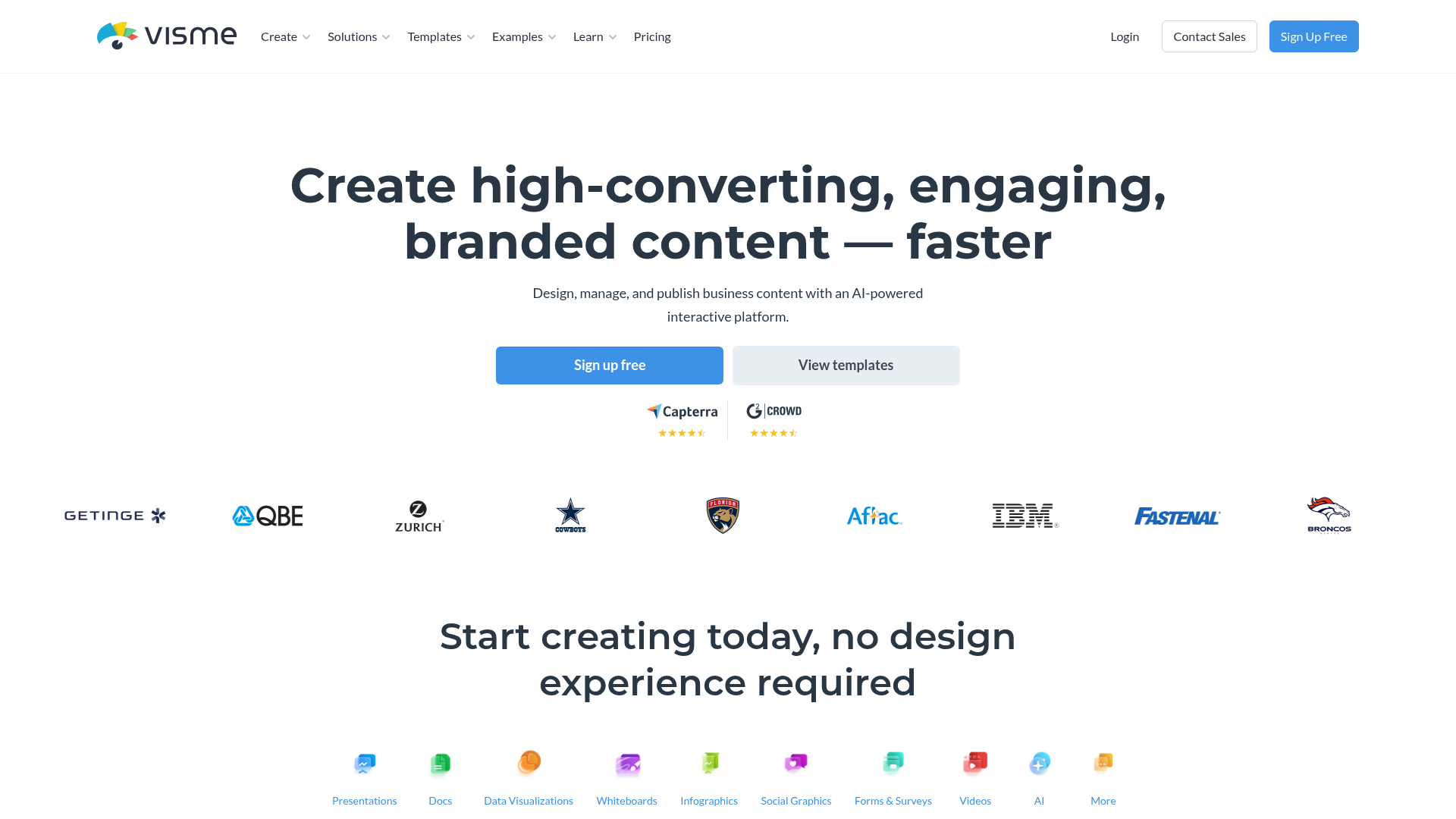
Visme is a visual content creation platform that covers presentations, infographics, reports, and interactive content. For PMMs, it's a practical option when you need to produce a high volume of product assets: pitch decks, one-pagers, competitive comparison visuals, and social graphics.
The template library is extensive, and the brand kit features help maintain consistency across assets even when multiple team members are creating content. Visme also supports interactive elements like clickable infographics and quizzes, which adds a layer of engagement beyond static visuals.
Where Visme fits the PMM workflow is in the "ship fast" lane. When you need enablement assets out the door without waiting for the design team's queue, Visme gives you enough control to produce polished work on your own timeline.
Best for: PMMs who need to produce a variety of product marketing tools and assets quickly, with built-in brand controls.
Key strengths
- Extensive template library for presentations, infographics, and reports
- Brand kit with locked fonts, colors, and logos
- Interactive content capabilities (quizzes, clickable infographics)
- Data visualization widgets for product metrics
- Collaboration and commenting features
- Export to multiple formats (PDF, HTML, video, social)
Pricing: Free tier available. Paid plans from $12.25/month.
5. Canva

Canva is the most widely adopted design tool for non-designers. For PMMs, it's the go-to for quick-turn product assets: social posts, internal presentations, email graphics, and simple one-pagers. It won't replace a dedicated storytelling platform for complex narratives, but it's the tool most PMMs already have open.
The real value of Canva in a storytelling stack is speed. When you need something shipped in 30 minutes, not 3 days, Canva delivers. The brand kit and template features keep assets on-brand even when multiple contributors are creating content across different campaigns.
Where Canva fits is in the everyday production layer. It's not where you build your product narrative. It's where you distribute it across the dozens of small assets that keep the story alive between major launches.
Best for: PMMs who need fast, accessible design for everyday product marketing assets.
Key strengths
- Intuitive drag-and-drop editor accessible to non-designers
- Massive template library across every content format
- Brand Kit for consistent colors, fonts, and logos
- Real-time collaboration and commenting
- AI-powered design suggestions and text generation
- Integrations with major platforms (Slack, Google Drive, HubSpot)
Pricing: Free tier available. Pro plans from $12/month per user.
6. Tableau

Tableau is the standard for data visualization and analytics storytelling. For PMMs, it's relevant when you need to build data-driven product narratives: usage dashboards for QBRs, market analysis for positioning, or competitive benchmarking visuals for leadership.
Tableau's Story Points feature lets you build sequential, narrated data presentations that walk stakeholders through a data-backed product narrative. The depth of data connectivity (hundreds of sources) means you can pull in product analytics, CRM data, and market research into a single story.
The honest caveat: most PMMs don't own Tableau directly and rely on an analyst or data team to build the views. If you have that access, Tableau is the most powerful data storytelling tool on this list. If you don't, tools like Infogram or Flourish offer a faster path to data visuals without analyst dependency.
Best for: PMMs who need data-backed product narratives and have access to a data team or analyst.
Key strengths
- Deep data connectivity across hundreds of sources
- Story Points for sequential, narrated data presentations
- Interactive dashboards with drill-down capabilities
- Strong community and template library
- Enterprise-grade security and governance
- Embedding capabilities for external-facing dashboards
Pricing: Tableau Creator from $75/user/month.
7. Microsoft Power BI
Microsoft Power BI is the enterprise BI platform that most SaaS companies already have access to through their Microsoft 365 subscription. For PMMs, it's the path of least resistance for data storytelling when the company is already in the Microsoft stack.
The free desktop version is surprisingly capable, and the natural language Q&A feature lets you ask questions of your data without writing queries. Paginated reports work well for formal product narratives that need to look polished in board decks or investor updates.
Where Power BI fits the PMM workflow is in internal product performance dashboards, launch metrics reports, and board-ready data narratives. The Microsoft 365 integration means you can embed visuals directly in SharePoint, Teams, and PowerPoint, which is where most internal stakeholders already consume information.
Best for: PMMs at companies already using Microsoft 365 who need data storytelling without a new tool purchase.
Key strengths
- Native integration with Microsoft 365 and Azure
- Free desktop version with robust capabilities
- Natural language Q&A for data exploration
- Paginated reports for formal product narratives
- Row-level security for controlled data sharing
- Embedding in SharePoint, Teams, and web
Pricing: Free desktop version. Pro from $10/user/month.
8. Domo
Domo is a cloud-based BI platform focused on real-time data storytelling for business teams. For PMMs, it's useful when you need always-current dashboards that pull from multiple data sources: CRM, product analytics, marketing automation, and finance.
Domo's strength is consolidating data from fragmented sources into a single narrative layer. With 1,000+ pre-built data connectors, you can build a live view of launch performance, pipeline impact, or product adoption metrics without waiting for an analyst to stitch together reports from five different tools.
Where Domo fits the PMM workflow is in leadership reporting and cross-functional visibility. When your VP asks "how is the launch performing?" and the answer lives across HubSpot, Amplitude, Salesforce, and Google Analytics, Domo gives you one place to tell that story with automated data storytelling capabilities.
Best for: PMMs at larger organizations who need real-time, cross-functional data narratives for leadership reporting.
Key strengths
- 1,000+ pre-built data connectors
- Real-time dashboards with automated refresh
- App-based storytelling for mobile-first consumption
- Embedded analytics for customer-facing use cases
- Collaboration features with alerts and annotations
- AI-powered insights and anomaly detection
Pricing: Custom pricing. Contact Domo for details.
9. Infogram
Infogram is a data visualization and infographic tool designed for teams that need to turn numbers into visual stories quickly. For PMMs, it's a practical choice when you need embeddable charts, maps, and data visuals for blog posts, landing pages, or reports.
The key advantage over heavier data storytelling tools like Tableau or Power BI is accessibility. You don't need an analyst. You don't need SQL. You import a spreadsheet or connect a data source, choose from 35+ interactive chart types, customize the branding, and embed it anywhere. The entire workflow takes minutes, not days.
Where Infogram fits the PMM workflow is in the "quick data visual" lane. When you need a chart for a product update blog post, a competitive comparison visual, or a customer-facing metric, Infogram gets you there without engineering help.
Best for: PMMs who need fast, embeddable data visuals for content and campaigns.
Key strengths
- Drag-and-drop chart and map creation
- 35+ interactive chart types
- Brand customization with locked templates
- Real-time data connections for live-updating visuals
- Embeddable and shareable across web, social, and email
- Team collaboration with roles and permissions
Pricing: Free tier available. Business plans from $19/month.
10. Piktochart
Piktochart is a visual communication platform focused on infographics, reports, and presentations. For PMMs, it's useful for creating product-focused reports, process documentation, and internal communications that need to look polished without a designer.
The template-first approach makes it fast for recurring content types. If you produce monthly product reports, quarterly competitive landscape visuals, or launch recap documents, Piktochart's templates let you update the data and ship without starting from scratch each time.
Where Piktochart fits the PMM workflow is in the "internal storytelling" layer. Not every product story is external. PMMs spend significant time communicating product narratives to internal stakeholders: leadership, Sales, CS, and Engineering. Piktochart helps those internal stories look as polished as the external ones.
Best for: PMMs who need to produce visual reports and internal product communications quickly.
Key strengths
- Template library for infographics, reports, and presentations
- AI-powered design suggestions
- Data import from spreadsheets for auto-generated charts
- Brand assets management
- Video creation capabilities
- Export to PDF, PNG, and interactive HTML
Pricing: Free tier available. Pro plans from $14/month.
11. Flourish
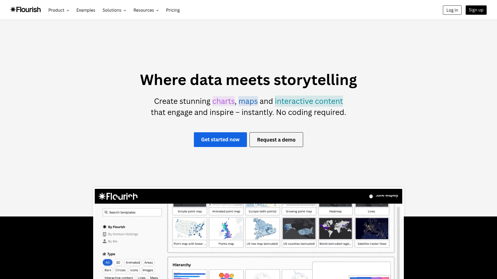
Flourish is a data storytelling platform known for animated, interactive visualizations. For PMMs, it's a strong option when you need product data to come alive: animated bar chart races showing growth metrics, scrollytelling narratives for product reports, or interactive maps for geographic adoption data.
The animated templates are particularly effective for launch announcements, product milestones, and board-level presentations where you need the data to tell a compelling story, not just display numbers. Flourish's Story format lets you build sequential, narrated data presentations that guide the viewer through a specific narrative arc.
Where Flourish fits the PMM workflow is in the "make the data memorable" layer. Static charts communicate information. Animated, interactive data visuals communicate a story. When the difference matters (launches, board decks, analyst briefings), Flourish delivers.
Best for: PMMs who need animated, interactive data visuals for product narratives and presentations.
Key strengths
- Animated and interactive chart templates (bar chart races, scrollytelling)
- No-code creation with extensive customization
- Embeddable visualizations for web and presentations
- Story format for sequential, narrated data presentations
- Team collaboration and brand customization
- Free tier for individual use
Pricing: Free tier for public projects. Team and enterprise plans with custom pricing.
12. Toucan Toco
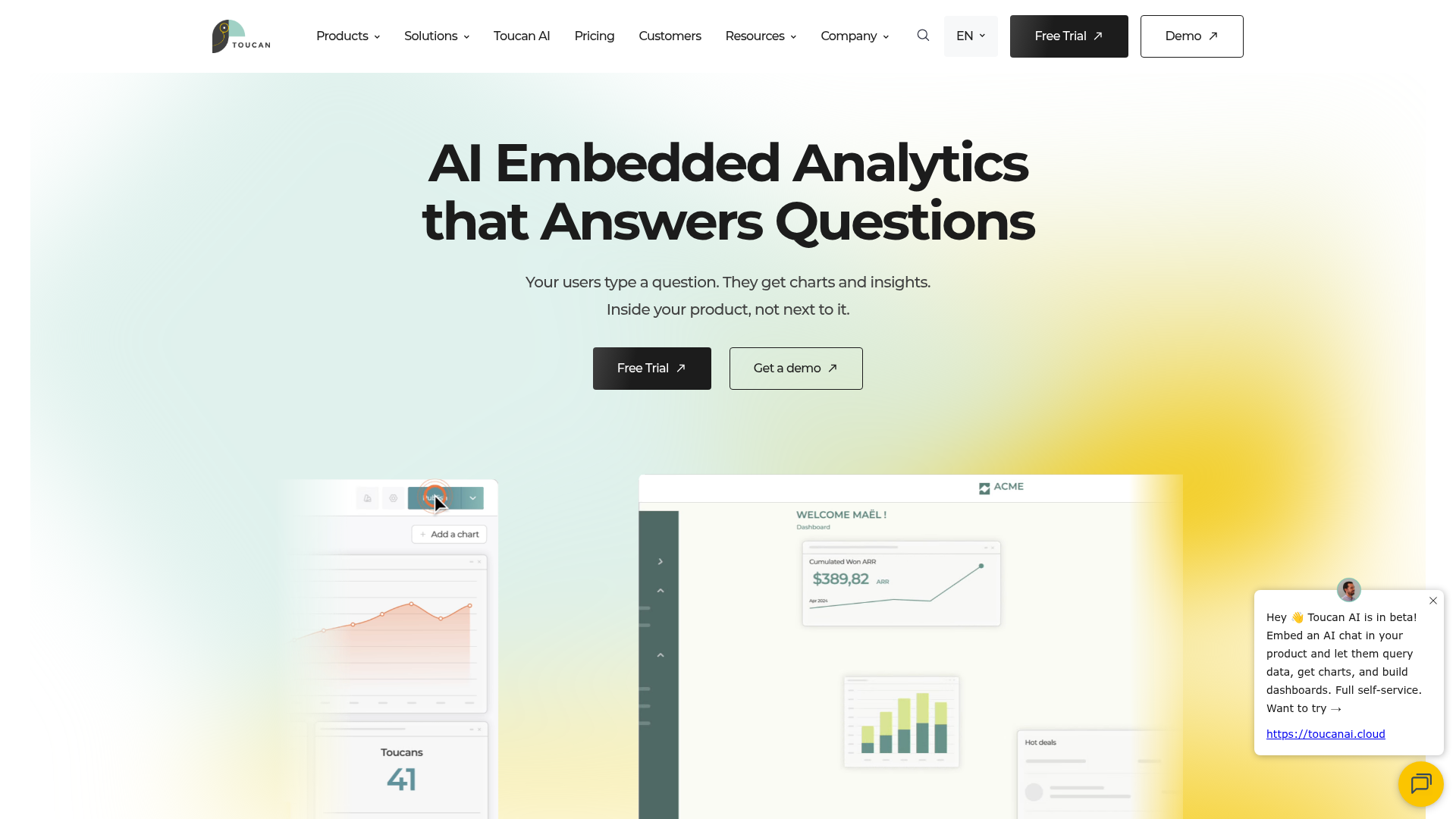
Toucan Toco is an embedded analytics platform designed for customer-facing data storytelling. For PMMs, it's relevant when your product story includes a data layer that customers need to see: usage dashboards, ROI reports, or benchmark comparisons embedded directly in the product or customer portal.
The guided analytics approach helps non-technical users understand data without training, which supports adoption and retention narratives. Contextual annotations explain what the data means, not just what it shows, which is the difference between a dashboard and a data story.
Where Toucan Toco fits the PMM workflow is when the product narrative extends beyond marketing into the customer experience. If your customers need to see their own data within your product, and that data is part of how you tell the value story, Toucan Toco is purpose-built for that use case.
Best for: PMMs whose product story includes customer-facing analytics or embedded data experiences.
Key strengths
- Guided analytics with contextual annotations
- Mobile-first, responsive dashboards
- White-label embedding for customer-facing use cases
- Storytelling-first approach to data presentation
- Pre-built connectors for common data sources
- Collaboration and sharing features
Pricing: Custom pricing. Contact Toucan Toco for details.
How to choose the right product storytelling software
Most PMMs will use 2 to 3 tools from this list, not all 12. The goal is to build a storytelling stack, not buy a single platform. Here's how to decide which tools belong in yours.
What story are you telling? Interactive product experiences need demo automation (Guideflow). Data narratives need BI tools (Tableau, Power BI). Visual web stories need design platforms (Shorthand, Ceros). Quick-turn assets need accessible design tools (Canva, Visme).
Who is the audience? Prospects evaluating the product need interactive experiences they can explore on their own. Internal stakeholders need data-backed narratives. Analysts and investors need polished visual reports. Different audiences need different storytelling formats.
How fast do you need to ship? Some tools require design resources and setup time. Others let you capture and publish in minutes. Match the tool to your timeline, not the other way around.
Does it integrate with your stack? CRM, CMS, marketing automation, analytics. A storytelling tool that creates another silo will not get adopted. Check integrations before features.
Can you measure impact? Engagement analytics, completion rates, conversion tracking. But be realistic: most PMMs operate with imperfect attribution. Look for tools that give you directional signal, not vanity dashboards that promise more than they deliver.
Will Sales actually use it? If the tool produces assets or experiences that Sales can share in one click, adoption goes up. If it requires training or a separate login, it will collect dust. The best presales software tools are the ones your cross-functional partners actually open.
Conclusion
Product storytelling in 2026 is not one tool. It's a stack that covers interactive product experiences, visual narratives, data stories, and designed assets. The right combination depends on your product, your audience, and where your current narrative breaks down.
The biggest gap in most PMM storytelling stacks is the "show" layer. Static content describes the product. Data visuals quantify the product. But interactive experiences let buyers experience the product directly, and that's the format that consistently drives the highest engagement and conversion.
Start with the layer that matches your biggest current gap. If your product story is told through decks and docs but prospects still say "can I see the product?", interactive demos are the highest-impact starting point.
Start your journey with Guideflow today!
FAQs about product storytelling software
Product storytelling software is any tool that helps teams create, distribute, and measure narratives about a product's value and capabilities. The category spans interactive demos, data visualization, visual web content, and content design. Most SaaS PMMs use a combination of tools across these categories to cover the full GTM motion.
Data storytelling focuses on turning numbers into narratives using charts, dashboards, and visualizations. Product storytelling is broader: it encompasses the full narrative about what a product does, why it matters, and how it works, using interactive experiences, visual content, and data as supporting elements. Data storytelling is one layer of product storytelling, not a substitute for it.
It depends on the storytelling need. For interactive product experiences, Guideflow is the strongest fit because it lets prospects and stakeholders experience the product directly. For data narratives, Tableau or Power BI. For visual web content, Shorthand or Ceros. Most SaaS PMMs use 2 to 3 tools across these categories to cover different touchpoints.
Interactive demos deliver a fundamentally different engagement model compared to video. Videos are passive: the viewer watches. Interactive demos let the viewer click through the actual product experience at their own pace. For product storytelling, interactive content drives higher engagement than static formats because the viewer is an active participant, not a passive watcher.
Notion and Google Docs work for internal positioning docs and messaging frameworks. They don't work for the distribution layer: interactive demos on landing pages, embeddable data visuals in blog posts, or immersive launch narratives. The gap is not in writing the story. It's in showing and distributing it across the touchpoints where prospects, customers, and stakeholders actually encounter your product narrative.
Practical metrics include: engagement rates (completion, time spent, drop-offs), conversion impact (demo-to-meeting, page-to-signup), enablement adoption (how often Sales shares the asset), and qualitative feedback from the field. Be honest with yourself: attribution is never clean in product marketing. Look for directional signal, consistent patterns, and correlation with pipeline outcomes rather than expecting perfect measurement from any single tool.
Speed to create and iterate, collaboration and approval workflows, brand controls, analytics, integrations with CRM and CMS, and distribution flexibility (embed, link, share). For interactive formats, also look for personalization capabilities and engagement tracking at the session level. The features that matter most depend on whether your bottleneck is creation, distribution, or measurement.
Interactive demos are the "show" layer of product storytelling. They let prospects, customers, and internal stakeholders experience the product's value directly, without scheduling a live call or provisioning a trial. PMMs use them across the full GTM motion: landing pages, sales follow-ups, onboarding, partner enablement, and launch campaigns. They perform best when paired with visual and data storytelling tools that provide the broader narrative context around the product experience.

.avif)


.avif)